Table of Contents
Visual weight – a term you didn’t know you knew. It’s a concept that is so deeply embedded in design and marketing that it often goes unnoticed, but in this post I’m going to shine a light on it, and explain how it can be used as invaluable tool in design for marketing campaigns.
What is visual weight?
Visual weight is how strongly something pulls at the viewer’s attention or, in other words, how “loud” it is. When you add a background or border to an element, you’re adding visual weight. When you make something harder to see, or “quieter”, you’re removing visual weight. Text or graphics that have a lot of visual weight feel heavy, while those with little visual weight feel light.
Keep in mind that visual weight can be somewhat subjective and vary case by case. Nothing is always heavy or always light; everything is relative to other elements on the piece.
Factors that affect visual weight
There are many factors that go into visual weight, and each can be added to one another to create complex hierarchies. Let’s take a look at some basic weight scales that you might already be familiar with.
Font Boldness
The boldness of a font, called “font weight,” directly correlates to its visual weight.

Where does your eye gravitate? Probably to the Black because it’s the most different from the other text and the background. This font has the heaviest visual weight.
Color
The darker the color, and the greater the difference between it and the background, the more it stands out.
Keep in mind, darker colors have more visual weight on light backgrounds, but light colors have more visual weight on dark backgrounds.

Size
The bigger the object, the heavier it is visually.

If you can see the connection, essentially the more of the background is obscured by the object, the heavier the object is.
Order
In English, we read left to right and top to bottom. Because of this, our eye is naturally drawn to the top left and works its way down. This factor doesn’t affect visual weight as much as the others, but is something to keep in mind when creating a layout.
Using visual weight in a composition
When combining these factors in a design, they might not add up the way you’d think, so step back and look at where your eye goes first and follow it through. It’s important to avoid having multiple elements with similar visual weights, as that can cause elements to compete, and leave the viewer without any direction to absorb the content. For instance, most designs have one primary headline, rather than several. As a rule of thumb, it’s best to have several distinct levels of visual weight in your composition.
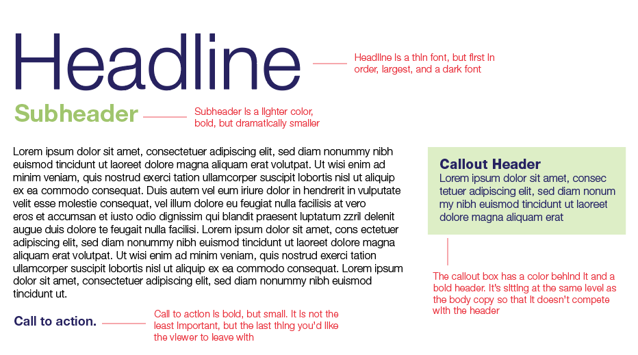
Here is an example of combining font, color, size, and order to create a dynamic but clear visual hierarchy:

Notice that what likely calls your attention first is the notes. This is because the red is the most distinct from the rest of the composition.
In Summary
To add visual weight:
For calls to action, headlines, etc.
- Increase boldness
- Increase color contrast to background (make darker on a light background, or lighter on a dark background)
- Increase the size
- Move up and/or to the left in the layout
To remove visual weight:
For disclaimers, explanatory text, etc.
- Use a thinner font
- Decrease color contrast (make lighter on a light background, or darker on a dark background)
- Decrease the size
- Move down and/or to the right in the layout
Remember, visual weight will affect the order in which your viewer takes in a marketing component. Keep the most important items heavier than the less important items, and make sure to avoid having multiple items of the same weight that compete with one another.
IF YOU HAVE MOSTLY THINGS THAT ARE HEAVY, IT CAN COME ACROSS AS A BIT TOO ASSERTIVE.
If you have mostly things that are light, it will come across as unimportant.
So next time you are looking at a marketing piece, make sure the visual weight is where you want it to be and your message will come across smoothly.
