Table of Contents
Effective logo design requires a combination of intuition and strategy. I love this quote about how the two work together:
“…by combining the intuitive immediacy of symbols and metaphors with strategic thinking, you integrate essential information that helps your logo stand out and be remembered.” — Maggie Macnab, published in Smashing Magazine
Getting a logo to feel “right” takes intuition, empathy, and a design instinct for how to translate concepts into visuals. Of course, there is the essential first step of understanding what the “right” feel for a brand is, which often takes as long as or longer than the actual logo design.
What Should a Logo Say?
Sometimes when new business owners learn that we design logos, they’ll show us a logo that’s in progress and ask if we think it’s any good. I usually answer with the question, “what are you trying to say with your logo?” because beyond basic criteria like clarity, simplicity, and memorability, the actual standards for logos are different for every organization.
For example, depending on target audience, you might want a logo to be contemporary, classic, or both. You might want it to be text-based or iconic, conservative or bold.
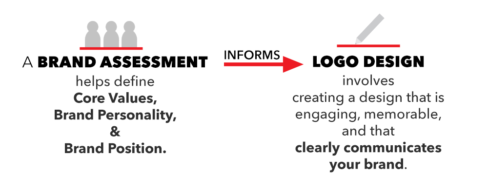
We generally divide logo design into two phases: brand assessment and logo design. In brand assessment, we work closely with an organization’s stakeholders (leadership, staff, volunteers, audience, etc) to form an understanding of an organization’s identity and position in their market. From this, we put together in-depth and detailed guidance to inform design.

Although the product of a brand assessment isn’t as visually exciting as that of the design phase, it’s absolutely essential. The criteria that come out of these discussions give the organization a way to decide which final design is right for them, and they also provide essential guidance to the logo designer.
The Gravity Group Logo
In this post, I’m going to deconstruct the Gravity Group logo in terms of what it says and how it says it, connecting visual design to strategy and vise versa. Let’s start with one of the first decisions we made: the color.
Why Red?
One of the first questions we asked ourselves was how far we were willing to go with our redesign – should our new logo be completely different from our old one, or should it honor it in some way? In the end we decided to honor the old logo by keeping the visual elements that people would connect with on the most basic level – color and shape. This creates a strong intuitive connection between our old and new brand identity.
That decision still gave us a lot of room to work creatively. We kept the red and black motif from our old logo, but we chose a variation on the red that felt more bold and energetic. This kept the color theme from our old logo intact, but gave it an entirely different feel that we feel better matches our brand.
Organic Shapes
In brand assessments, you get input from a lot of people, but interestingly, all that diverse and nuanced feedback will generally be united by a small set of high-level themes. Finding these core themes is the key to effective logo design, because a logo is so simple that you only have room to communicate a few basic concepts.
It’s important to note that these high-level themes are generally simple, fundamental concepts, such as “technology,” “idealist,” “bold,” “family”. These simple concepts are what make you feel when you see a logo. They touch people subconsciously. After establishing the basic themes of a logo, you can layer on specific concepts like “computers,” “coffee,” or “branding.”
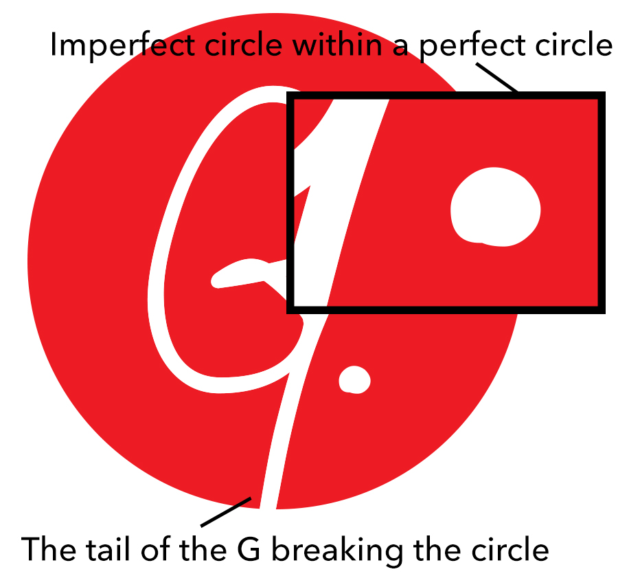
 One of the core themes that arose in our brand assessment was “organic”. Our firm is very people-centered, and our work requires us to balance strategy and effectiveness with empathy, creativity, and intuition. Our decision to honor our old logo by using some sort of circular shape in our new brand identity worked well with the “organic” concept. However, the circle we ended up with was a perfect one, and so we further emphasized the concept of “organic” by including the imperfect, hand-drawn “G”. We also contrasted the larger perfect circle with the hand-drawn, imperfect period within it.
The tail of the G breaking the outer circle speaks to this same concept. That, together with the organic period shape, create a visual tension between “organic” human elements and perfect “manufactured” elements, which in turn echoes the balance of strategy and intuition that we practice in our work.
The Signature G
The most prominent visual aspect of our logo is the G within the larger red circle, which we call “the signature G.”  It’s intentionally prominent because it represents one of the most important and fundamental concepts that differentiates our brand: integrity in business. Ethics and integrity play into the marketing tactics we use (white hat marketing only…more on this in other posts), the clients we choose to work with, and how we treat each other and those we partner with and serve. The signature G communicates this concept of integrity in a simple, visually succinct and intuitive way – it’s our personal word, our mark.
Font and Lettering
We chose a font that is classic, but understated. We wanted it to complement the themes and concepts in the icon, without overshadowing or competing with it.  In the end, we chose a sans-serif font to communicate the bold, contemporary feel of the icon. The font has a simple, well-designed feel that makes it feel classic and timeless without taking attention away from the icon. The font overall, and especially the lowercase “g”, give it an elegant, organic feel that complements the balance of organic and perfect shapes in the icon.
How It All Comes Together
 All these visual decisions come together to produce a logo that is simple, bold, and memorable. It communicates the fundamental aspects of our brand personality – our people-centered approach to business, defined by a commitment to marketing ethics and business integrity, as well as our ability to balance grounded, timeless work with bold, creative vision.
In our logo design for clients, we’re constantly reminded of how much you can say with a few simple shapes and words. As in many areas of design, less is more. And in logo design in particular, because you’re working with so little material, every decision, no matter how minor, makes a big difference.
