Table of Contents
They say a picture is worth a thousand words, but what about just a color? There’s a science behind which colors provoke certain emotions and each color can say a lot more than you might think.
Why is color important?
Research into color theory can benefit many projects, from establishing a brand’s identity, to creating a theme for a brochure, or choosing the look of a button on a website. Furthermore, knowing how to use color in print and digital materials effectively will reinforce your message and help build a strong, consistent, brand identity.
A few things to know:
Warm colors are generally associated with optimism and energy and are good for calling attention to something and/or encouraging haste.
Cool colors are generally associated with peacefulness and rest.
Lighter tints of a color can be more inviting and friendly.
Darker shades of a color can be more professional and serious.
A note before we continue: different cultures often have very different interpretations of color, so it’s important to know who the audience is for your design before you make strategic color decisions. This post focuses on western understandings of color. For more information specific to a country, click here.

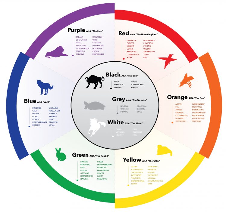
Red is an attention getter. It’s bold and powerful, can evoke hunger, and is even known to increase a person’s heart rate. Red is passionate – which means it can be happy or angry. As a result, it is best used cautiously.
Adjectives: Loving, excited, intense, alert, desirable, bold.
Commonly used by businesses that offer: Emergency healthcare, fast food, athletic wear, entertainment, and energy drinks.
Examples: Red Bull, Chick-Fil-A, YouTube, Reebok, Valley Urgent Care.

Orange is less aggressive than red, but still draws the eye. It can be funny, youthful, vibrant, and determined. Despite its intensity, it remains inviting and cozy. Orange combines the childlike spirit of yellow with the urgency of red.
Adjectives: Happy, fun, enthusiastic, playful, ambitious.
Commonly used by businesses that offer: Food, home furnishings, and humor.
Examples: Nickelodeon, Reese’s, Ashley Furniture, Home Depot.


Yellow is also hard to overlook and is typically used as a cautionary color because of its visibility. It can represent knowledge, youth, inspiration, and friendship. In small doses, yellow is bright, warm, and cheerful.
Adjectives: Joyful, youthful, active, cautionary, confident.
Commonly used by businesses that offer: Tools/machinery, energy/gas, communication, and transportation.
Examples: Cat, BP, Ferrari, Hertz, Sprint, Snapchat.


Green takes on the peacefulness of nature and symbolizes new life, growth, and renewal. Of all the colors, it is the least straining on the eyes and can be broken down into more tints and shades than any other color. It can be inspirational, make people feel safe, and balance a design. Green combines the youthfulness of yellow with the serenity of blue.
Adjectives: Calm, free, growing, stable.
Commonly used by businesses that offer: Lodging, kids’ toys, education, outdoor equipment, electronics.
Examples: Leap Frog, Land Rover, Android, John Deere.


Blue evokes security, trust, and relaxation. It has connections with technology, wisdom, faith, and reflection. While blue can be sorrowful, it is also very comforting.
Adjectives: Calm, serene, focused, hopeful, safe.
Commonly used by businesses that offer: Banking, social media, technology, cleaning products, religious services.
Examples: Bank of America, Twitter, Dell, Glade, Dawn.


Purple represents creativity, royalty, and wealth. It combines the loudness of red with the sophistication of blue.
Adjectives: Independent, nostalgic, mysterious, passive, ambitious, exotic, elegant.
Commonly used by businesses that offer: Luxury items, chocolate; or want to be associated with: royalty, mystery, or nostalgia.
Examples: Cadbury, Hallmark, SyFy, Taco Bell.


Black is the boldest and strongest of the colors. It can easily add assertiveness when paired with another color. However, black has a heavy visual weight and as a result, should be used in moderation. Similar to purple, it represents sophistication and elegance.
Adjectives: Edgy, powerful, strong.
Commonly used by businesses that offer: Makeup, shoes, perfume, musical instruments.
Examples: Adidas, Clinique, Covergirl, Chanel, Fender.


White represents cleanliness, peace, and health. It does an excellent job of calming other colors and adding breathability. It can be used to lighten the visual weight of any brand. Due to its neutrality, all businesses can benefit from adding white to their color palette, and most companies can utilize a white version of their logo. However, some companies will use a white version of their logo more often than not as it can better represent their brand than the alternative.
Adjectives: Virtuous, sterile, healthy, pure, innocent, free.
Commonly used by businesses that offer: Athletic wear, entertainment.
Examples: Nintendo, Disney, Puma, Apple.


Grey holds the formality of white and black while adding flexibility. It isn’t too loud or too quiet and pairs well with other colors. Because of this, it can be used across businesses when paired with other colors.
Adjectives: Neutral, timeless, formal, practical, solid.
Commonly used by businesses that offer: Automobiles, digital information or tools; or want to be considered timeless.
Examples: Wikipedia, Nissan, WordPress, Jaguar.

In Conclusion
People will see a color before anything else, and careful color choice will help with meaning and recognition. If you’d like to learn more about the psychology of color, check out this website, and keep color in mind for your next project!
More on Branding & Design


